Sunday 24 April 2016

Concept Artists

Concept Artists 


We were tasked with finding a concept artist from the industry that we liked the work of and then we had to explain what we liked about the pieces we had chosen and also what we thought of the concept artist and their work. 

Claire Hummel

Claire Hummel is a concept artist for the video game Bio-shock: Infinite, she has been getting some attention from the work she did on bio-shock however there is one piece of her work that i really do like and that's this piece below:
I really like this piece of work for multiple reasons one of which is the detail in which has been used for the image itself, not only has she paid extreme attention to detail Claire has created the setting for the image perfectly not to mention the piece of paper on the table too. the drawing of the werewolf is incredible and looks really professionally done. Here are some of her other pieces of work:

Life Drawings

Life Drawings

For part of this module we have to do a series of drawings/observations of the human body, each Wednesday we had a life drawing class where someone from the public most likely a nude model would come and do a series of poses for us to draw.

Life Drawing was helpful to know how the human body looks in different positions and also how the structure of the body can be drawn differently to show different assets.

In the first week we began drawing a male model, this was a shock at first however it was really helpful as i could really see the structure of the models body and also how the human body changed shape in different poses. Here are a couple of images that i have taken of my art work during the first few week..


For the first few drawings we did we were tasked with just 2 minutes to draw the model however we then changed poses and also changed how long we got to draw the model for. The more finished drawings were the ones that we got a lot more time for as i could focus on different parts of the body and how the looked from the model. 

For our second model we were again tasked with the different times however this model had something unique about them as we began drawing we could clearly see an abdominal scar.. this didnt change the way we drew him however gave us a more interesting approach to the model. In these images i wanted to forget the scar and draw the model as i would anyone else so in the images below the model has no scar. 


Our third model that we had was a female model, i really enjoyed drawing our female model as i felt alot more confident in my drawing and also the female body has alot more curves, this means that i can create shapes that i see in the body and not worry about how rigid they look. I think my drawings from the Male model dont compare to the ones of the female model. I felt like it didnt matter how my drawings looked and that my proportions were more accurate. 


These were the only drawings i though were finished on the female model. On the last two images you can see that the model has lines across her body; these are called contour lines. contour lines show the curvature of the body and also which parts of the body are where just like contour lines on a geographical map when it shows a mountain etc.


Friday 15 April 2016

Week 7 - Human and Character Proportions

Human and Character Proportions

in the seventh week we learn about different proportions of the human body.
We studied both male and female bodies and determined what was different when we compared the two.

Male Body:
The Male Human body has wide shoulders, narrow waist and slim hips.
This means that the widest part of the body is the shoulders on the male human body.
The Males legs are more angular and have a lot less body fat compared to the torso area.

Female Body:
The Female human body has narrow shoulders, slim waist that goes down to wide hips. this is due to the pelvic bone being bigger to support a child.
The female figure is more rounded and the female body has a much more flexible spine.


When creating a character you need to think about the proportions of the character and how you want your character to look. If you are creating a skinny character they tend to become tall with long arms and legs however if you are creating a small chubby character you will need to make him small limbed and squished together.
For my character i use an average build with his shoulders being larger that his main torso but because he has a coat on it isn't really noticeable.
Below is a difference in character notice that the proportions of each character is different. 


Wednesday 13 April 2016

week 6 - Environment Design

Environment Design


In our assignment we are tasked to create three things, a character, a prop and also an environment in which the character would fit. The character i have chosen needed a dark and moody setting with some sort of lighting to show hes in a city so i came up with the idea of possibly placing my character in an alley with dim lighting to create a dark and gloomy mood. on the other hand i thought that i could create an environment where my character is shown to be important and powerful, this of course would be an office. 

I decided that i would create the alley environment as i thought this gave the character a more gloomy and interesting appeal. below is the final result that i have created using different textures, lighting effects and blurring certain brush strokes. I've also added the character into the environment to see what it would look like all together.
As you can see i created a one point perspective piece that shows an alley being lit by surrounding light from two windows. As this was a traditional alleyway i wanted to add some sort of grate on the floor which you can see to the left of the character. I also added in a dumpster on the right of the character to show that this was indeed an alley but also to create some scale to the character. 
I created this alley in photoshop and also Adobe illustrator, these two programs allowed me to create 3D looking boxes such as the dumpster but also to create the lighting effects seen from both of the widows on either side. 

Monday 11 April 2016

Week 5 - Perspective

Perspective & Vanishing Points


In this lesson we learnt about different perspective views, how they can be used and also how effective they can be. 

The first perspective angle we focused on was the one point perspective view, this is a view where the image is focused from one point in the image for example in this image below there is only one point in the photo where the camera is focusing on, as you can see the road in the image looks like its dissapearing, this is called a vanishing point; a vanishing point is when something in the image like a road carries on until it can no longer be seen any more. its common for the vanishing point to be in the centre of the image however it does not have to be. 
 

Another perspective view we looked at was the two point perspective, this is when there are two points in an image where the image is focused on, for example this building in the image below has red lines drawn on to indicate where the two point perspective is coming from. Two point perspective usually allows buildings or objects to appear bigger than they really are.  

Three Point Perspective is similar to two points however there is another point of focus, this would make a building look alot taller that it really is as the third point located at the bottom of this image below could be used as a vanishing point to make the image look like its been drawn or photographed from high up.  

For all of these perspectives there is an invisible line that is called the eye level line, this is used to locate certain parts of the perspective view and also can be used as a control for the image. 
On the image of the road the eye-level line is shown to be in level with the bottom of the two mountains (it is more noticeable on the left mountain) 
On the Image of the building of the two point perspective it is shown on the second red line from the bottom, this is in line with the front corner of the building. 
and in the last image the eyeline level is located between the two points at the top of the image. 

Week 4 - Props

Prop Design


In the fourth week we were tasked to create a prop or a series of props for the character who we were going to be drawing, from the concept that we had chosen we had to draw a prop that was suitable for our character. 

My character concept was an 1950's New York Gangster, this was an individual that had a beige long trench coat, trilby hat and smart attire. in the 1950s mobsters and gangsters were known for using Thompson "Tommy" Machine guns to eliminate anyone who threatened them or got in their way. this seemed like a suitable prop for my character as its not only just accurate in the time scale but also that its typical for my character to have a weapon of some sort on his person. 


The sessional task that we were given was to draw out the prop that our character would have used whether this is a weapon or something of another nature. 
I began by getting an image off the internet as reference for the weapon, i then started to block out the shapes of the Tommy gun. 
I believed this to be the sort of weapon for my character to carry on his person, this could also be a symbol that my character is in power as he has a powerful weapon and would need to defend himself from someone trying to kill him. 

Week three - Design Process and Thumbnails

Design Process and Thumbnails


When an artist gets a brief they create small thumbnails to show what they are thinking about the brief and possible ideas for the brief. thumbnails are simple black and white 2 minute sketches that can show a lot of detail as they often spark an idea for a bigger piece of work. 

An artist can create hundreds of small thumbnail sketches that could be pointless however among some of them thumbnails there could be some that inspire for a bigger idea. 

Once the artist has created some of these sketches they then think about the colour scheme of the environment they have created for example: background colour, sky?, possible clothing colours for any individuals in the thumbnail?

We got told to draw an image on paper that we could possibly make in to an environment, we then scanned in the image and found a suitable picture from the internet to draw over. we imported the paper image into Photoshop and then overlayed it onto the picture. we then created an entirely different image from the two images we had before. 

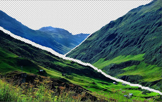
we were also tasked with focusing on composition, we had to seperate an image into 3 sections. Foreground, Middleground and the Background. we could select which ever image we wanted to use so i chose to use an image of a valley.
I though that this image was excellent for separating into sections as there are clear borders to where the three sections intertwine. i imported the photo into photoshop and simply selected each section and brought it away from the rest of the photo using the layer via copy function, this allowed me to select certain sections and separate
them from the rest of the image. here are the three sections split up.