Design Process and Thumbnails
When an artist gets a brief they create small thumbnails to show what they are thinking about the brief and possible ideas for the brief. thumbnails are simple black and white 2 minute sketches that can show a lot of detail as they often spark an idea for a bigger piece of work.
An artist can create hundreds of small thumbnail sketches that could be pointless however among some of them thumbnails there could be some that inspire for a bigger idea.
Once the artist has created some of these sketches they then think about the colour scheme of the environment they have created for example: background colour, sky?, possible clothing colours for any individuals in the thumbnail?
We got told to draw an image on paper that we could possibly make in to an environment, we then scanned in the image and found a suitable picture from the internet to draw over. we imported the paper image into Photoshop and then overlayed it onto the picture. we then created an entirely different image from the two images we had before.
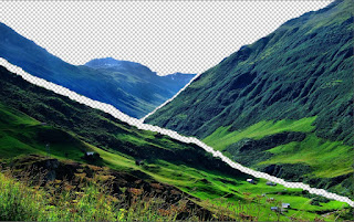
we were also tasked with focusing on composition, we had to seperate an image into 3 sections. Foreground, Middleground and the Background. we could select which ever image we wanted to use so i chose to use an image of a valley.
 them from the rest of the image. here are the three sections split up.
I though that this image was excellent for separating into sections as there are clear borders to where the three sections intertwine. i imported the photo into photoshop and simply selected each section and brought it away from the rest of the photo using the layer via copy function, this allowed me to select certain sections and separate
 them from the rest of the image. here are the three sections split up.

No comments:
Post a Comment