Friday, 11 December 2015

Alien Head

For the final project in Games Texture Development we had to use Zbrush to poly paint an alien head. we had full freedom as to how we painted it and once it was painted we would get the diffuse map from the model and apply it to a low poly model in Maya.

Zbrush

To me zbrush is a relatively new program to me, I have used it before however didn't know what I was doing and was only messing around in it to see what it was like. 
We were taught how to use the many different features of Zbrush for example how to navigate the program, select different layers and also how to mask different parts of the object we were painting. 

I used masking to stop myself painting the wrong part of the model for example on the neck i wanted some orange paint on the gills this was a huge benefit to have as i was struggling to get into the tight corners and the brush seemed to carry onto the polys next to it. 

For the model I decided to create a green alien with a red/ dark brown mouth. i decided to paint the alien green as i thought that i wanted it to stand out from the red of the mouth and also from the background that i was going to render it with. I also decided that the top of the head needed to be a different colour so i decided that on an orange colour that would really stand out against the green that i painted the head in. Below is the diffuse map that was created from the Zbrush OBJ file in XNormals. 

Because this version of the diffuse map isnt detailed at all i thought that i would have had to go over all of the markings on the zbrush model and add them to the diffuse map. I didnt realise that we were suppose to generate an Ambient Occlusion map, Once i realised this i generated one from my OBJ file and then applied it over the diffuse map with an overlay setting in photoshop and got the result i was expecting, a detailed diffuse map that i could then add a normal map to make the texture look more detailed. 
I found a texture that i wanted to use for the eyes and added it to the diffuse map. I then rendered the normals using an external cage i had exported from maya and imported into Xnormals, with xnormals i can generate a normal map using the cage from the low poly model in maya and using the mesh of the Zbrush OBJ file, combine the two and the normal map gets generated from this. 
Once i had created all of my maps i then added them all onto a lambert that i assigned to my low poly model in maya and added a directional light to light up the scene along with a background of a wall and rendered the front and the back of the alien head. Here is the final render.


Wednesday, 9 December 2015

Texturing the Cottage

for this task we had to create a texture for a cottage mesh we were given. the mesh we were given had all of the UVs layed out for us all we had to do was create a normal map of the cottage and texture it. 

In the previous task we textured the door of the cottage, this was part of the cottage done and all we had to do was transfer the normals and texture onto the door in the cottage scene. 


Once the door was sorted out I then began creating the textures for different parts of the cottage, I started with the roof of the cottage mainly because I knew it was all going to be one texture and also it was the biggest UV set on the model. I wanted a tile effect on my roof and found a really nice simple texture. I created a normal map from the texture using crazy bump and applied it to my roof on the cottage. 


Once the roof was done i then looked at the main part of the building, i decided that i wanted the cottage to be a stone cottage with wooden beams. I got the Uv's for the main building and began to texture it accordingly.
 

I then textured the front and the back of the cottage, these too were going to be made from stone with the beams being wooden again. i used another wood texture for the beams on the front of the building because i thought that the front would be more presentable and stand out more. In the image below you can see that in the stone texture there is an orange square, this is the window of the cottage and later was used as an incandescence map, this allows for the light in the texture to be amplified and emit light.

I then created the texture for the pillars surrounding the cottage, i felt like this cottage could possibly be on grass of in some sort of muddy ground so i decided to create some mud splatters around the bottom of the pillars, i thought that this would give the cottage come context and really illustrate its surroundings. 

After i had created all of the textures for the cottage i added some lights into the scene and began rendering. I thought that i should add something into the scene that gives the cottage an environment so i got a sphere deleted half of the faces and added a grass texture to it giving the cottage a sense of being on a hill of some sort. 


Texturing the Door

Cottage Door Texturing

For this task we were given a Maya file that contained both a High Poly mesh of the door and also a low poly mesh of the same exact door, our task was to create a normal map from the high poly door and apply them to the low poly door.

The first thing that I did was put all of the high poly meshes into a layer and the same with the low poly meshes. this allows me to see one set of meshes while the other is hidden, just helps with knowing which mesh is which.

secondly, I created the normals for each part of the door, i did them separately because i felt like it gave a cleaner normal map than baking them all together.

Once I had created the normals for the mesh I then created a texture that would be applied to the door when I imported into the cottage scene. I went with a series of wood textures one for the door itself and one for the frame of the door. i made the frame of the door a little darker as i wanted the actual door to stand out.


Monday, 23 November 2015

Texturing with Normals

Texturing With Normals


We were told to choose two or three images from the internet that we thought looked flat and that could be combined with a normal map to give the illusion that it ad depth to it. I chose two images that i though would work really well. The first one was a metal texture that looked like it had a couple of ledges on, I felt like these edges cold look more pronounced with the use of a normal map. 

The second image was a simple wooden paneling that I though with a normal map the groves in the wood and inbetween the panels could be shown a lot more. 


I used a program called Crazy Bump to generate the Normal Maps for both images, this is an easy and effective way to generate normal and Ambient Occlusion maps.


Once Crazy Bump had created all of these maps I then created planes for them, applied the textures and the bump maps and rendered them. The textures looked exactly how I wanted them to look with the metal texture being raised and the groves of the wood texture being enhanced. 

Sci-Fi Crate Texturing

Sci-Fi Crate Texturing


Normals & X-Normals

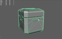
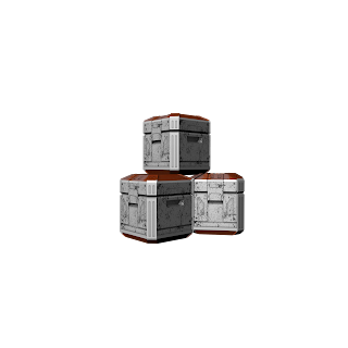
For this project we were given the Object Files of two crates, one being the low poly crate which was very simplistic and plain and then the second crate which was the high poly crate; this crate had much more detail including beveled edges and alot more polys.
Low Poly Crate & High Poly crate


The OBJ files were imported into Maya and we began the project. we put the objects into layers so that each component for each crate could be contained but also could be toggle to be either visible or not. 
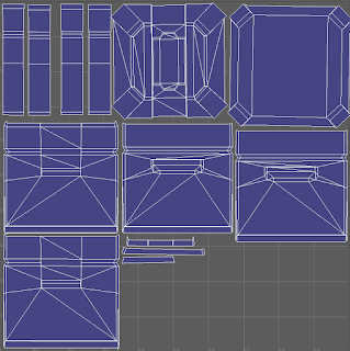
Once we had studied the objects we began creating the UV's for them, this was a very slow and tiring process as we were planar mapping each face. Planar mapping is when UV's are projected onto an object through a plane, Planar mapping is primarily used on flat surfaces or on objects that can be viewed from one camera angle. 

When all the UV's for the Crate were gathered, I sorted them so i knew which UV shell was which and also where they were for example i grouped the UV's from the bottom and the top because i knew they would have the same texture applied to them. The Blue shells are the UV Shells, the reason as to why they are blue is to show that the light from the scene is hitting it correctly and that the faces of the mesh aren't flipped around. 

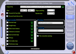
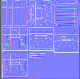
Once the UV's were layed out i created a normal map; a normal map also known as a bump map allows for all of the high detail and parts of the high poly model that are raised or cave in to be taken and flattened into one image, this image allows the low poly model to seem to have the same attributes as the high poly model. Below is the normal map that has been generated and has been applied to the low poly model. The way I created the normal map was by using a program called X-Normals. X-Normals allows you to import both high and low poly OBJ files and creates the normal map from the High Poly Model and applies it to the UV's of the Low poly model giving you the result below. 

When the Normal Map was created I then needed to create an Ambient Occlusion Map, this again using X-Normals i could create this map, Ambient Occlusion maps give the object the overall lighting and allows the object to receive and understand the light in the scene. The ambient occlusion map also highlights any shadows in the mesh. I then created the texture with a few White damaged plastic images that I thought went really well for this crate and I also went with an orange top and bottom to give the crate some colour, this was done with a very glossy plastic image which I then gave a colour overlay to give it an orange colour. 

The Finished product on its own in the View-port looked really good and I was pleased as to how the white and the orange complimented each other. Below is the Final Render. 

Thursday, 5 November 2015

Spellbook Modelling and Texturing

Spell Book Modelling and Texturing 

For this assignment we had to design, model and texture a spell book. this post shows how I have modeled my spell book and also how I have textured it. 

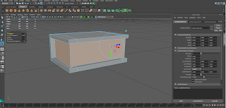
Simple cuboid to start off with.
I began modelling the spell book with a simple cuboid shape. I then used the edge loop tool in Maya to create some divisions which I could then extrude later. 


Extruded Inwards.
Once I extruded the faces inwards I was left with a shape that looked like some kind of book. this would create the ridge of the book and also the pages that the cover would contain. 
I created a separate model for the latch that would hold the front and back covers together. this would be textured with a keyhole on the front that gave the illusion that the book was locked and belonged to the key holder. 

I then Layed out the UV's for the spell book by using an automatic mapping tool, this tool sets 6 planes around an object to capture the UV's of each side of the spell book. Below are the UV's that the automatic mapping tool layed out for me. As I thought these weren't too hard to understand and texture I decided to use these instead of rearranging the UV's and using a Planar map instead. 


Once I had created a snapshot of the UV's that had been layed out I took the Jpeg Image of the UV's into Photoshop; its here where i will texture the UV's accordingly. At first I wasn't entirely sure what UV's belonged to which part of the book. So I decided to create labels for each part of the UV on Photoshop as you can see below. 

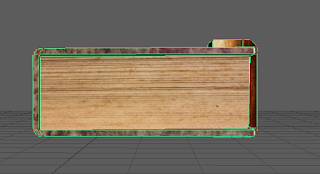
I then applied the texture to the model in Maya 2016, this let me see if anything in the texture needed re-positioning, the keyhole on the latch was in the wrong place when I originally applied the texture. 

Once I had re-positioned the new texture I then applied it again and these are the results:


Thursday, 1 October 2015


Photo Manipulation Task - 01/10/15

In Game Texture Development we were tasked with manipulating an image from the internet in Photoshop, this was to get us used to creating textures and familiar with the User interface of Photoshop. 
I began my dark gloomy hole in the wall with just a simple empty room. I chose this image simply because it was very clean and simplistic. 
I began to draw simple light strokes with the brush tool; using a light grey to create an outline. I then changed the colour of the brush to a much darker purple. 


As you can see the room doesn't look very dark or gloomy, so I decided to select the layer that contained my clean wall and play around with the black and white levels located in the adjustments menu. This then created the image you can see at the top of this post.